Why Yellow on Blue? The Color Thinking Behind Our Fishing Shirts
Why bright yellow on blue beats black for a fishing tee: contrast, how eyes see color on the water, and how we design shirts that read from across the dock.
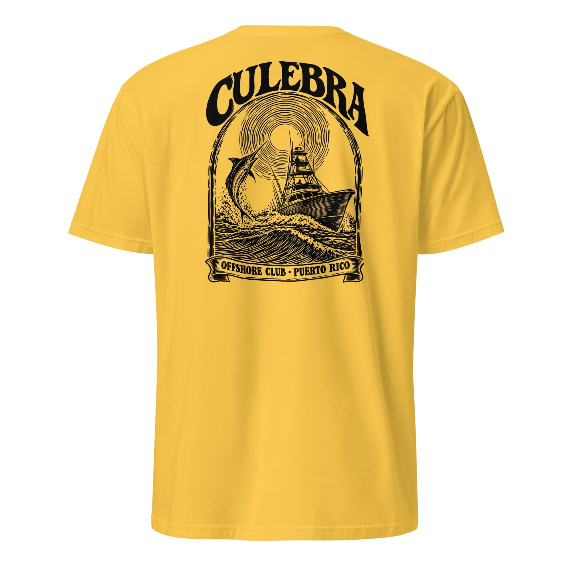
When we showed early versions of our new fishing designs, the feedback on one was instant: yellow on blue was the winner, and black was too much. That gut reaction turns out to have good reasons behind it. Color on a fishing shirt isn't just taste. It decides whether the design reads from across a dock, whether it looks right in hard sunlight, and whether the shirt feels like it belongs on the water. Here's the thinking that goes into the colors of our fishing line.
Contrast is what your eye actually reads
A design is visible because of contrast: the difference between the ink and the shirt behind it. There are two kinds. Lightness contrast is the difference between light and dark, and it does most of the work when you read shapes and letters from far away. Color contrast is the difference in hue, such as warm against cool.
Yellow on blue scores high on both. Yellow is the lightest-looking of the bright colors, and medium-to-deep blue is dark, so there's plenty of lightness contrast. They also sit on opposite sides of the color wheel, so each makes the other look more vivid. That's why you see the pairing on road signs, school buses on blue skies, and safety gear. It's one of the most legible combinations there is.
Black ink on a blue shirt is the opposite. Both are dark, so the lightness contrast is weak and the design sinks into the shirt. In a photo, or from a few feet away, black-on-blue can look heavy and muddy, which is exactly the "too much" feeling people describe.
Why it works especially well on the water
Out on a boat, almost everything around you is blue or blue-green: sky, water, the reflections in between. Bright sun adds glare that flattens dark colors. A dark design on a blue shirt disappears into that background, while a bright yellow one jumps forward. Human vision is most sensitive to light in the yellow-green part of the spectrum, which is part of why high-visibility gear leans on those colors.
There's also a feeling to it. Yellow and blue are sun and sea. They show up on lure boxes, marina signs, buoys and classic sportfishing boats. A yellow-on-blue fishing shirt looks like it already belongs at the marina.
How we design for one bright ink
Using one strong ink color on a dark shirt is a discipline. Every part of the art has to be made from shapes and lines in that single color, with the shirt showing through for the shadows. We draw our fishing art in a bold woodcut or engraving style, with thick confident lines, clear silhouettes for fish and boats, and lettering big enough to read from a dock. Thin hairlines are avoided because they fade into a dark shirt at a distance.
When it comes time to print, bright ink on a dark shirt needs a hidden layer. Direct-to-garment printers lay down a white underbase first, then print the yellow on top, so the yellow stays bright instead of soaking into the blue cotton. Our production partner handles that automatically, but it's one reason we test every color pair on an actual shirt mockup before it goes live.
When black ink is the right call
This doesn't mean black never works. On light shirts it's perfect. Our Culebra Offshore Club Tee, a woodcut sportfishing boat running past a leaping marlin under a carved sun, is printed in black ink on light colors like Daisy, White, Sand, Light Blue and Ice Grey, and switches to white ink on Navy, Black, Military Green and Charcoal. The rule is simple: dark ink on light shirts, light ink on dark shirts, and when you want a design that pops, pick a bright ink with a strong partner color. Yellow and blue are the best example.
Other color pairs that work on a fishing shirt
- White on navy: crisp, classic and nautical, and the safest choice for a club or tournament shirt.
- Navy on sand or khaki: relaxed and coastal, and kind to sun-faded looks.
- Coral or orange on teal: tropical and loud in the best way, great for island designs.
- Yellow on royal or navy blue: the highest-energy pairing, made for being seen.
Shop the fishing shirts
We're working on yellow-on-blue fishing designs now. In the meantime, here are fishing pieces you can order today:
- Culebra Offshore Club Tee: woodcut boat and marlin, in nine shirt colors.
- Reel Busy Organic Tee: for anyone whose calendar says "fishing".
- Culebra Marlin Polo: a small embroidered leaping marlin in white and gold on a navy polo, smart enough for the dock bar.
Want your boat, your fish or your crew name in yellow on blue? Send it to us on our custom shirt page and we'll draw it up with a mockup before you pay a cent. Everything is made to order with free US shipping, and you can find more in the Rags collection.